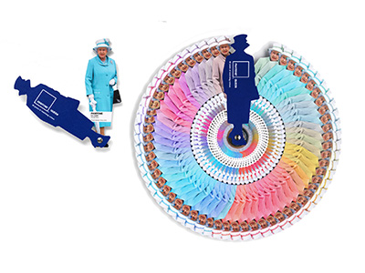
Pantone is marking the Diamond Jubilee in offbeat style, with a limited edition Queen-shaped fan guide inspired by the colours of dresses worn by Her Majesty over the past 60 years.
Developed in conjunction with agency Leo Burnett, just 60 copies of the guide were digitally printed and sent out to notable figures worldwide, including one in a special presentation box that was sent to the Queen herself. Each leaf of the fan is a cutout picture of the Queen, wearing the same hat and dress but each in a different colour.
According to Pantone: ‘For over 60 years, Her Majesty has opted for a full spectrum of perfectly colour coordinated ensembles, from the Primrose Yellow she wore at Will and Kate’s wedding in April 2011 to the tasteful Lilac Snow outfit she wore last year during a visit to Northumberland.’
The fan guide includes colour references and cites the date and location that determined the colour choice of her outfits. It was printed by Precision Printing in London on one of its HP Indigo 7500 digital presses, with the seven-colour ink set (CMYKOV) for IndiChrome on-press Pantone emulation. This is said to be able to match 97% of the Pantone colour range.
Justin Tindall, executive creative director at Leo Burnett London, said: ‘When you see footage, or read commentary, of Queen Elizabeth on her official engagements, at a Royal Wedding or even watching her horse race at the Derby, there is always mention of what she’s wearing. It has been an ever-present subtext to the 60-year reign of our Monarch. The Diamond Jubilee Colour Guide is a celebration of that reign through colour and its meaning – a blend of Leo Burnett’s creativity and Pantone’s expertise in honour of the Diamond Jubilee.’
Leatrice Eiseman, executive director of the Pantone Colour Institute, commented on the Queen’s colour choices: ‘The Queen’s decision to favour one colour in every outfit is a strong style statement. Monochromatic colour schemes make the wearer appear taller, delivering a more stately air – perfect given that Queen Elizabeth is not tall at 5’4”. Choosing one colour theme also ensures the outfit does not detract attention from the wearer – which is particularly important if you’re the Queen.’
Selecting feature colours from the Queen’s wardrobe, Leatrice reflects on some of the most notable colour selections:
* Pantone 13-0755 Primrose Yellow. ‘The Queen’s royal wedding outfit from 2011 was Primrose Yellow. Yellow is a colour that speaks to the future with hope and optimism. William’s wedding was a time of national celebration and this choice of yellow complements the joyous mood of the occasion. It’s a colour that is high visibility (befitting a queen), while still not detracting from the bride.’
* Pantone 13-4411 Crystal Blue. ‘Blue is a colour staple in the Queen’s wardrobe, it’s a colour that communicates constancy and it is also symbolic of her devotion to the British people. Blues traditionally have calming properties and she is often seen wearing them during difficult times. Blue is also seen as de-stressing so it’s no surprise she was sporting a serene blue to a Royal Garden Party in 2010.
* Pantone 16-2124 Pink Carnation. ‘Queen Elizabeth wore lighter tones of pink more frequently when she was younger, adding softness to her role as Queen and make her seem less austere, for example the Pantone 16-2124 Pink Carnation she wore to the Chelsea Garden Party in 1967. In recent years however, she has been seen in trendier bright pinks, defying her age and communicating that she is a monarch modern in thought and spirit.’
* Pantone 13-5414 Ice Green. ‘During the Queen’s landmark state visit to Ireland, the first since the country gained independence in the 1920s, she was seen in a cool shade of green. Her colour choice echoed the sentiment of her visit as green is widely seen to symbolise new beginnings, fresh thoughts and rejuvenation.’
Contact: www.pantone.co.uk

